
With one of the oddest and shortest names for a new technology in a while, WebP is a new image format which was originally developed by Google. The reason for this format is to improve the efficiency of the image compression in order to greatly reduce the size of the images.
This of course means less bandwidth to load a website and therefore faster websites, which is one of the key goals Google wants all web developers to deliver. Anyone who’s trying to ensure they have the best SEO optimisation for their site should therefore be looking at WebP as a high priority!
Incorporating both lossy (JPEG and similar) and lossless (PNG and similar) formats, WebP is a universal format and has differing compression algorithms to optimise for both styles of images.
Official Site: A new image format for the Web | WebP
What’s the compression like?
To show a “real world” example, I’ve used an image by Erik McLean on Unsplash. This image is a JPEG image, which looks like the following:

The original image was 3.6MB. Now of course many of these images aren’t in a web friendly resolution to start with (it’s 5472 x 3648 pixels) but it’ll at least form the baseline for our comparison.
To first show what it can compress down to as a JPEG still but without any quality loss, I’ve used my favourite tool JPEGmini. For anyone who takes a lot of photos, this is a must have when it comes to reducing the size of your originals but retaining all of the quality. Using JPEGmini, we’ve reduced the size to 2.7MB or roughly a 25% saving. This is pretty good, and on higher resolution images I’ve found the results are as high as 50%.
Now to webP. I’ve used an online conversion tool (convertio.co) as the conversion tool as it’s just for a once-off image conversion. This has reduced the image size now down to 1.5MB or a nearly 60% reduction!
Not all images will have such a dramatic decrease in size, however Google are stating that on average they see a 25-35% reduction which is still a considerable improvement.
Is there quality loss?
There are two types of image compression schemes, lossless (meaning no loss in quality) and lossy. Images like JPEG are already lossy formats, meaning that they reduce the size of the file by trying to “combine” pixels of similar colours rather than storing them individually.
This is a large oversimplification of the way it works, but essentially the greater the compression then the greater the quality loss.
I cropped a section of the images to compare where there was a reasonable amount of detail and combined before saving in a lossless (PNG) format.

It was very difficult to find any difference between the three personally, which is a good thing!
Which browsers support it?
Of course, for the images to be displayed, web browsers firstly need to support the image format. The good news is that all major browsers except one support WebP:

Sadly, Apple has been very late to the party in providing WebP support while Google Chrome added support back in 2012. This means that while Apple drags their feet for political reasons (it’s not a technical limitation), you’ll need to provide backwards compatibility for Apple users.
Update: Apple finally added support in late 2020 for Safari on iOS and macOS with Safari 14, however this requires your macOS and iOS versions to be updated for it to work.
How can I provide backwards compatibility?
While Apple and some old corporate and/or government departments who are forced to use IE 11 will be the only ones affected by using WebP, thankfully the HTML img tag allows you to add backwards compatibility. Let’s take a look at the following example code:
<img alt=”This is a webP image” src=”/wp-content/uploads/2020/05/testimage.webp” />The src attribute tells the browser where to find the file, with the alt attribute simply to provide a non-visual descriptor of the image. In order to provide backwards compatibility, we can change this to a <picture> tag, which would look similar to the following:
<picture>
    <source srcset="/wp-content/uploads/2020/05/testimage.webp" type="image/webp">
    <source srcset="/wp-content/uploads/2020/05/testimage.jpg" type="image/jpeg">
    <img alt=”This is a webP image” src=”/wp-content/uploads/2020/05/testimage.jpg” />
</picture>
The <picture> tag allows for multiple <source> tags to be added, allowing the browser to detect what it supports and fallback to a standard JPEG or PNG file as required.
Of course, this adds significant complexities if you’re hand coding your site but also why using a plugin for your site will be the quickest route (with suggestions below!).
How can I test the difference?
To determine how much space you’ll save on your site, you can use Google Pagespeed Insights to test and measure the difference. For instance, I’ve used the SBS website (simply chosen as it was recently opened) as a test and you simply need to observe the Serve images in next-gen formats section:

You can click to expand to see what difference this makes to individual images on your site:
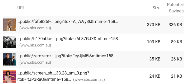
Google also gives an estimation in time based on the reduced download size, but this time will vary of course depending on the overall Internet connection.
Will I see it as an option in my photo editing software?
While the format and size improvements are great, it’s still very much a “new” technology when it comes to traditional photo editing systems. Plugins like WebPShop provide the ability to export images from Photoshop but for now most photo editors have poor to no support.
At some point in the future, we hope to see more systems using WebP out of the box so that more than just websites can take advantage of the space saving. For now, we suggest keeping originals in JPEG or PNG format and using WebP for your website only.
Ok, so how do I use it on my website?
In the latest Plesk Obsidian 18.0.27 release, all PHP versions now use the latest GD image library so that all of the Conetix Web Hosting systems (and others of course) now provide support to generate these images.
For websites running WordPress, this means plugins like WebP Converter for Media and WebP Express and many others can generate these images directly from your website and automatically optimise your site.
Of course, we very highly recommend that you take a backup first before proceeding, but all good plugins create a new WebP image while leaving the original image untouched. Here’s one quick example of the optimisations for a test site using WebP Express:

We’d then recommend testing your site both with your own browser to ensure there’s no anomalies but also using Google Pagespeed Insights so that you have a before and after comparison.
What if my hosting doesn’t support WebP yet?
First of all, ask your hosting provider if they do support it and if not, when they will. If they’re a Plesk based hosting provider then they’ll either have it on their plans to roll out soon or if you can be moved to a server which already supports it. At Conetix, we’ve already rolled out support to all of our web hosting plans and progressively rolling the update out to managed servers as well.
If there’s no support then you still have two options. The first option is to use an external platform to optimise the images. Some plugins provide this as a free option for a limited number of images whereas others it’s a small monthly fee to access their cloud based optimisation. There’s also third party services such as Cloudflare, which can automatically optimise the images for you on their paid plans.
The second option is of course to move providers. While this is a drastic option for many, you may find a better provider who offers things like the latest PHP versions a better fit for your business if you’re chasing better customer experiences. What’s more, the better hosting providers also provide free migration so that there’s no additional cost and no downtime involved.
Conclusion
With all browsers except one and with a fallback option, now is the time to convert your website to use WebP. By having the image libraries on your web server directly support WebP means you can run the conversions for free as well.
This fallback works well enough that you probably didn’t notice nearly all images on the Conetix site are WebP based and therefore worked without issue.
Even with a modest 30% reduction in image size (you may see 60% or more!), this can represent a significant gain for users on less than optimal connections such as mobile users.